WordPress & responsive development
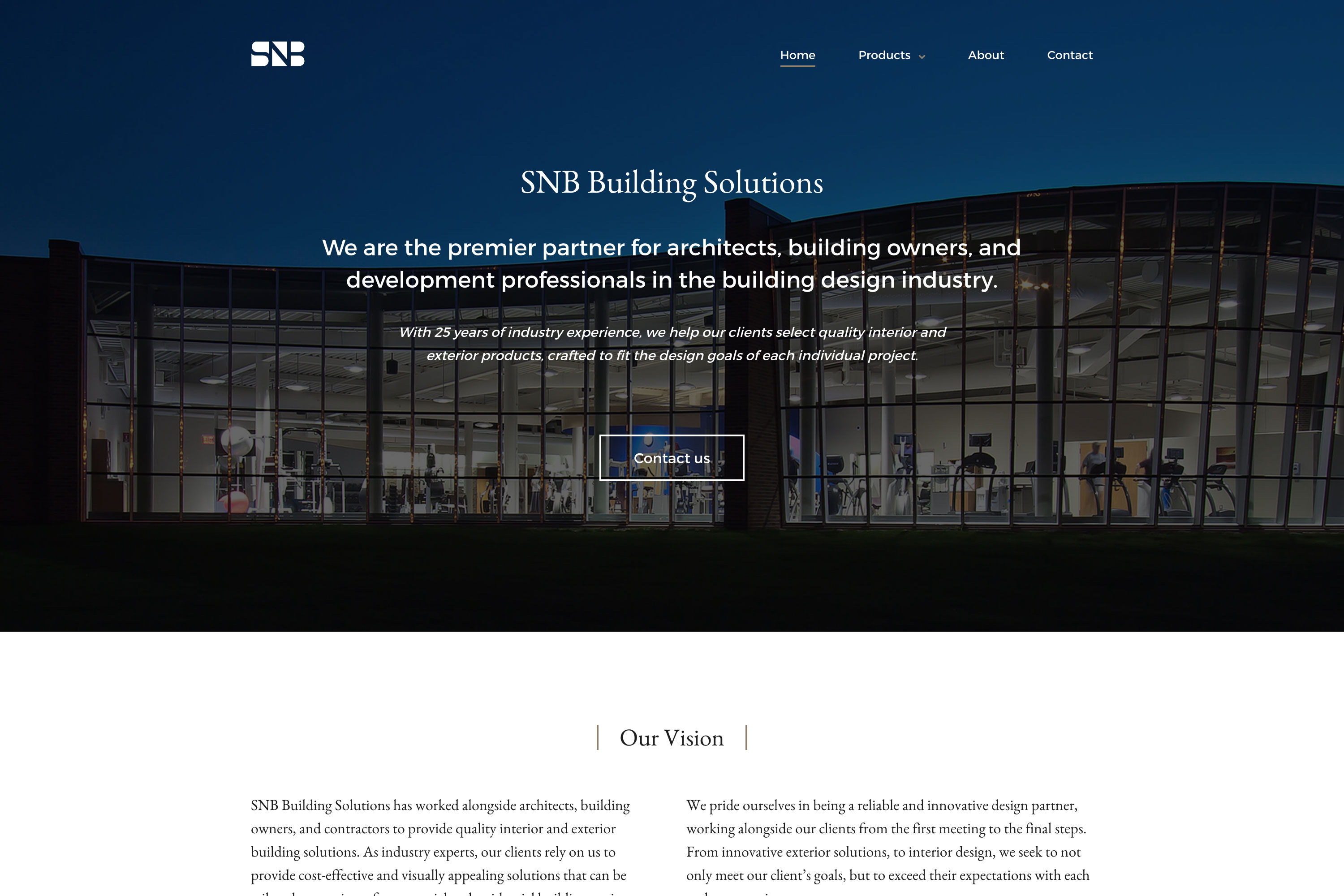
We were happy to take on the development of the SNB Building Solutions website, partnering with the talented folks at Omaha Video Solutions on the design. This mobile-first site serves as a showcase of the projects SNB has completed, categorized by product lines. A beautiful masonry-style grid is used throughout the site that opens up full-size photos with a lightbox-esque functionality. Every piece of content and photography on the site is fully customizable and editable by the client, ensuring that photos are cropped properly to cover all the different responsive sizes they can be viewed at.
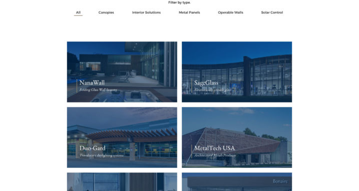
The product grid features a slick hover animation to quickly view more information
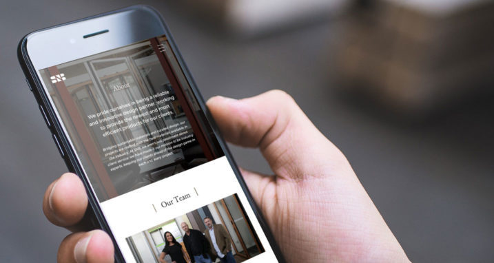
Built mobile-first, the website of course looks just as good on a phone as it does a desktop
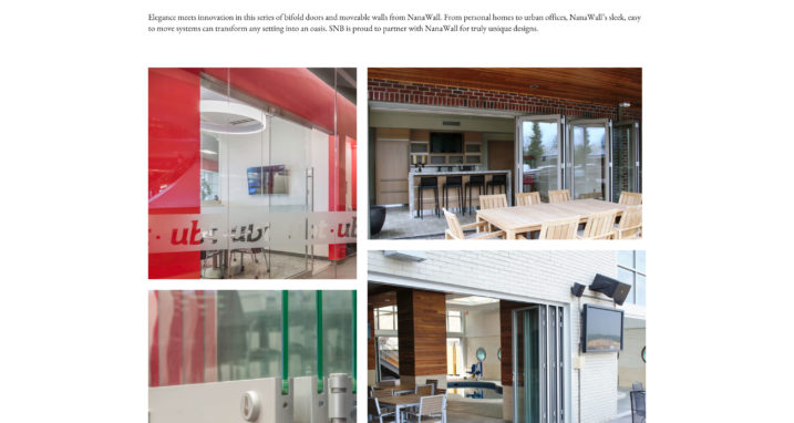
This masonry grid is used throughout the site for an elegant display of photography
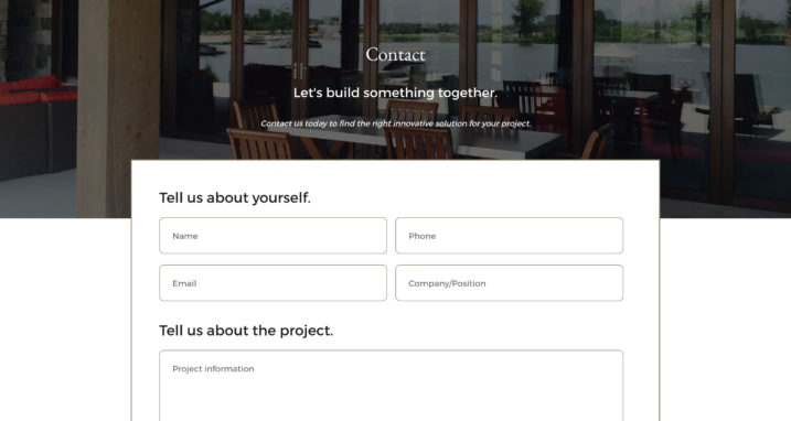
A secure contact form lets users contact SNB quickly